Visualizing Protests for Racial Justice with ggplot and gganimate
On May 25, 2020, George Floyd, an African American man, was killed by a White police officer in Minneapolis, Minnesota. His murder came shortly after the homicide of two other African Americans: Ahmaud Arbery, on February 23, 2020, and Breonna Taylor, on March 13, 2020. These horrible crimes sparked a movement and a wave of protest, unlike anything we’ve seen in recent years in America.
The objective of this post is to visualize these protests and their magnitude. I’m going to use the impressive data provided by the folks at countlove.org. They crawl daily media coverage about protests and carefully curate it, including links to the sources. To find out more, please visit their website countlove.org.
If you know me, you know that my research interest lies in trying to understand how institutions and public policies shape economic outcomes and life in cities. I’m especially interested in how crime, violence, and discrimination shape our cities. For example, in a recent working paper, we seek to highlight how much harder it is for minorities to have access to a neighborhood with clean air (a nice write up from medium.com is here). I hope that with my research, I can contribute to the ongoing discussion of the far-reaching consequences of discriminatory behavior.
Let’s shift gears and move into the visualization of the protests sparked by this heinous homicides.
Loading packages and data
We start by loading the packages we’ll be using in this post
require("dplyr") #for data wrangling
require("stringr") #for string wrangling
require("ggplot2") #for ploting
require("gganimate") #for animations
require("maps") #for us maps
Then the data.
db<-readRDS("protets_data.rds")
Let’s take a peek to the data:
colnames(db)
##  [1] "Date"                     "Location"
##  [3] "Attendees"                "Event..legacy..see.tags."
##  [5] "Tags"                     "Curated"
##  [7] "Source"                   "Total.Articles"
##  [9] "long"                     "lat"
## [11] "state"
The data provided by countlove.org comes with a date, location, attendees, tags to identify the type of protests, if the source was curated, the source, and total articles. I augmented the data geocoding the locations with longitude and latitude to put them on a map.
A time line of protests
My focus today are on protests against racial injustice so I’m going to filter those protests only
db_race <- db %>% filter(grepl("Racial Injustice",Event..legacy..see.tags.))
I first want to generate a count of the number of protests by date,
db_race_daily<- db_race %>% group_by(Date) %>% summarize(number_protests=n())
With that, I can generate a simple geom_line plot
p <- ggplot(db_race_daily, aes(Date, number_protests)) +
  geom_line() +
  labs(x = "Date", y = "Number of Protests \n for Racial Justice") +
  theme_bw()
p
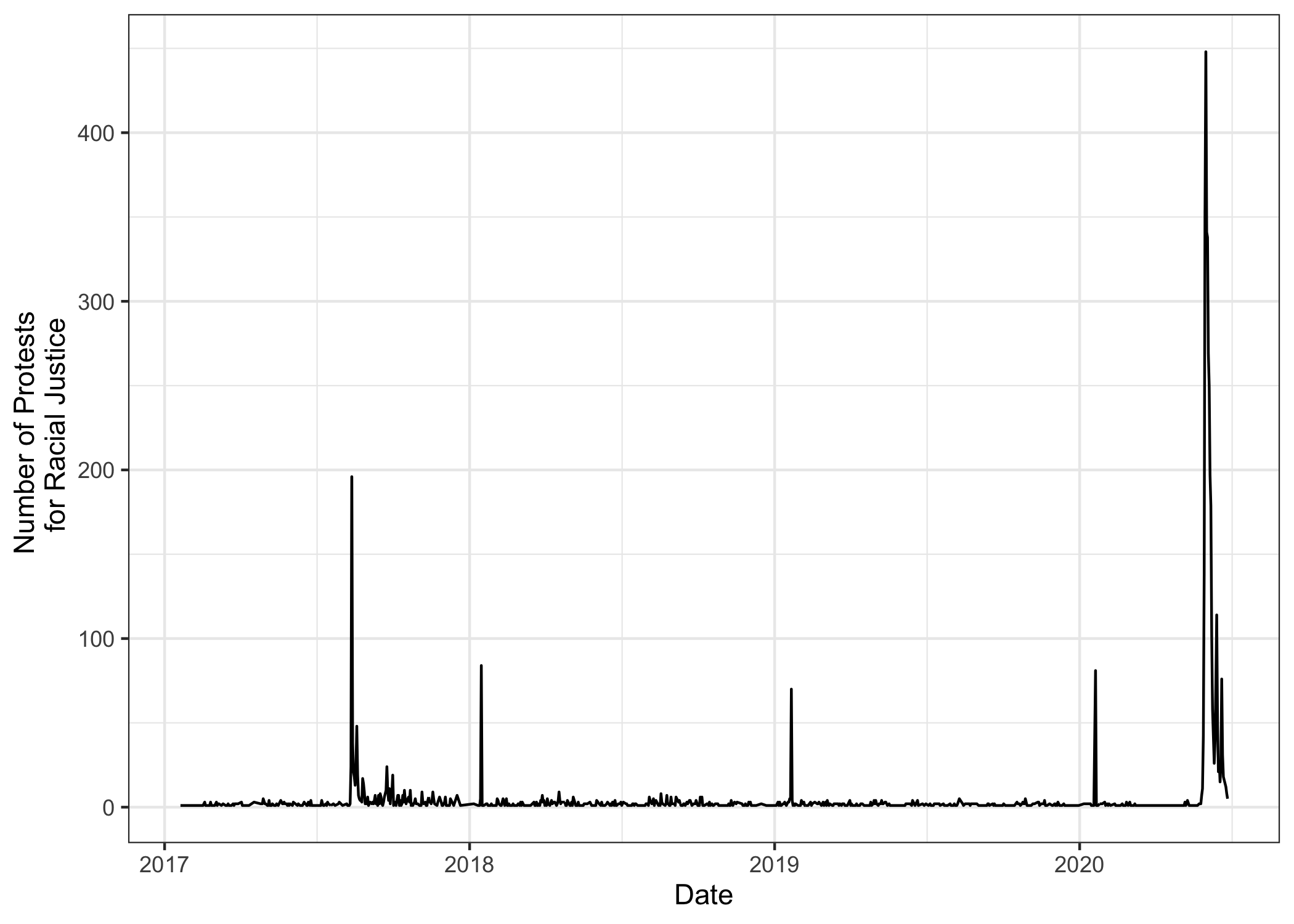
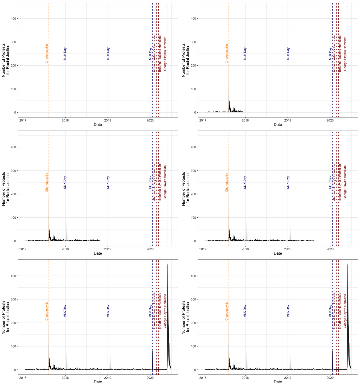
We see a spike in 2020. Let’s add a couple of markers to highlight when the murders of Ahmaud Arbery, Breonna Taylor, and George Floyd happened.
p<-p +
  geom_vline(xintercept=as.Date("2020-02-23"),col="Dark Red", lty="dashed") +
  geom_text(aes(x=as.Date("2020-02-23"), label="Ahmaud Arbery's Homicide", y=250), colour="Dark Red", angle=90, vjust = -0.5,size = 3) +
  geom_vline(xintercept=as.Date("2020-03-13"),col="Dark Red", lty="dashed") +
  geom_text(aes(x=as.Date("2020-03-13"), label="Breonna Taylor's Homicide", y=250), colour="Dark Red", angle=90, vjust = 1,size = 3) +

  geom_vline(xintercept=as.Date("2020-05-25"),col="Dark Red", lty="dashed") +
  geom_text(aes(x=as.Date("2020-05-25"), label="George Floyd's Homicide", y=250), colour="Dark Red", angle=90, vjust = -0.5,size = 3)
p
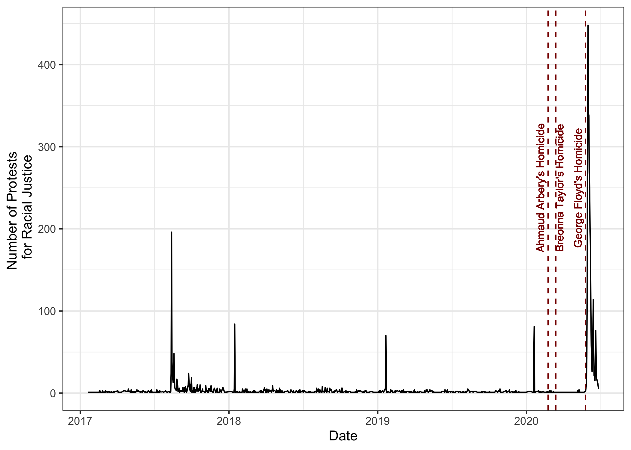
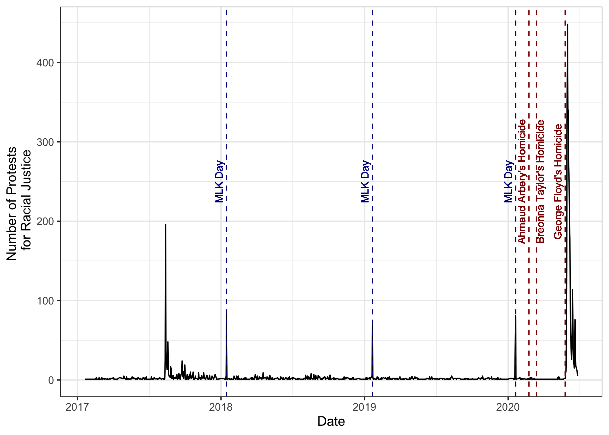
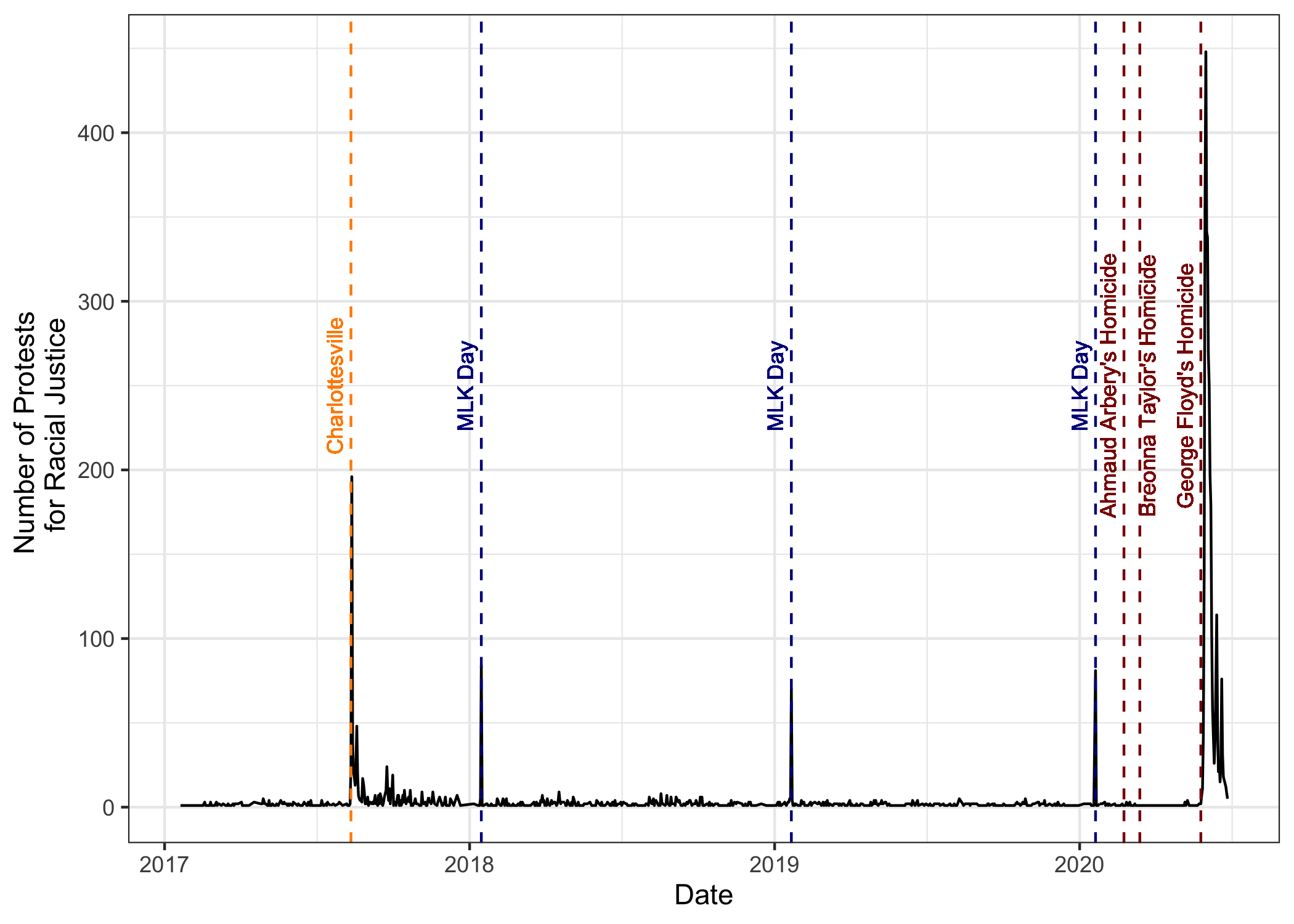
We see a couple of demonstrations in previous years, especially each year on Martin Luther King Jr. Day, but nothing like after George Floyd’s Homicide. The other big spike in 2017 is after the “rally” at Charlottesville, VA.
Let’s add markers first for MLK day using geom_text.
p<-p +
  geom_vline(xintercept=as.Date("2018-01-15"),col="Dark Blue", lty="dashed") +
  geom_text(aes(x=as.Date("2018-01-15"), label="MLK Day", y=250), colour="Dark Blue", angle=90, vjust = -0.5,size = 3) +
  geom_vline(xintercept=as.Date("2019-01-21"),col="Dark Blue", lty="dashed") +
  geom_text(aes(x=as.Date("2019-01-21"), label="MLK Day", y=250), colour="Dark Blue", angle=90, vjust = -0.5,size = 3) +
  geom_vline(xintercept=as.Date("2020-01-20"),col="Dark Blue", lty="dashed") +
  geom_text(aes(x=as.Date("2020-01-20"), label="MLK Day", y=250), colour="Dark Blue", angle=90, vjust = -0.5,size = 3)
p
and now one marking the “rally” in Charlottesville, VA.
p<-p +
  geom_vline(xintercept=as.Date("2017-08-12"),col="Dark Orange", lty="dashed") +
  geom_text(aes(x=as.Date("2017-08-12"), label="Charlottesville", y=250), colour="Dark Orange", angle=90, vjust = -0.5,size = 3)
p
p<-p + transition_reveal(Date)
animate(p, fps=5, end_pause = 20)
### Mapping protests in the contiguous United States
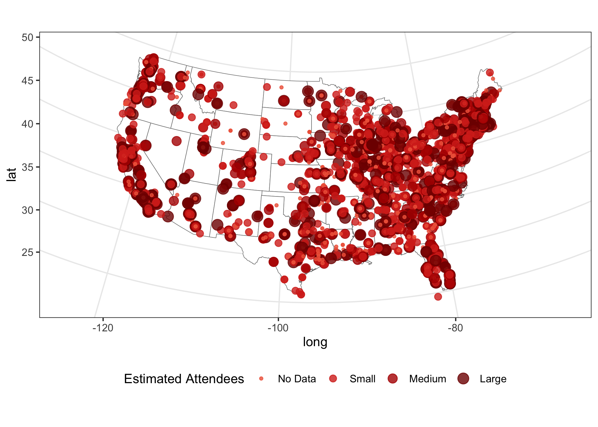
Where are these protests happening? We can use the location data, which
I geocoded to map out the protests and their size using the Attendees
information on the data. The data on Attendees is not complete, so I’m
just mutating it into a factor that divides into its terciles and a
fourth factor with No Data. Using this trick, I can plot all
protests and not have ggplot drop locations with missing attendee
data.
quantile(db_race$Attendees,probs=seq(0,1,.33),na.rm = TRUE)
##   0%  33%  66%  99%
##    0  100  200 4680
db_race <- db_race %>% mutate(Estimated_Attendees=cut(Attendees,breaks=c(0,100,200,1000),labels=c("Small","Medium","Large")))
db_race <- db_race %>% mutate(Estimated_Attendees=ifelse(is.na(Estimated_Attendees),"No Data",Estimated_Attendees))
table(db_race$Estimated_Attendees)
##
##       1       2       3 No Data
##    2135     638     731    2070
db_race <- db_race %>% mutate(Estimated_Attendees=factor(Estimated_Attendees,levels=c("No Data","1","2","3"),labels=c("No Data","Small","Medium","Large"),ordered=TRUE))
Now we are ready to plot the data. We use the ggplot's map_data()
function to turn data from the maps package to be used in a ggplot.
us_states <- map_data("state")

map_p<-ggplot(data = us_states, mapping = aes(x = long, y = lat, group = group)) +
          geom_polygon(color="gray48",fill="white", size = 0.2) +
          coord_map(projection = "albers", lat0 = 39, lat1 = 45)  +
          geom_point(data=db_race, aes_string(x="long", y="lat", group="Location",size="Estimated_Attendees",color="Estimated_Attendees"),alpha=0.8)  +
          scale_size_discrete(name="Estimated Attendees", range=c(1,4)) +
          scale_color_manual(name="Estimated Attendees", values=c("#ef6548","#d7301f","#b30000","#7f0000")) +
          guides( colour=guide_legend()) +
          #theme_void()
          theme_bw() +
          theme(legend.position="bottom")

map_p
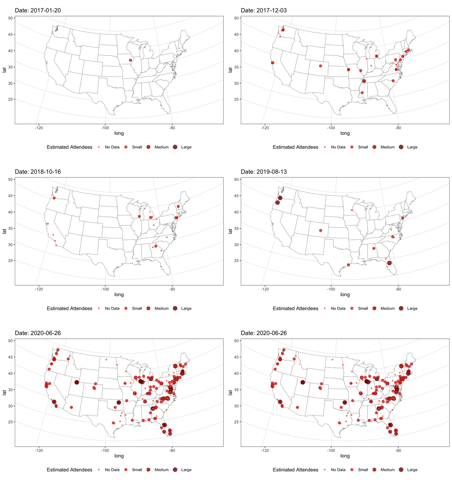
And now and easy time-lapse with gganimate. Note that I reduced the
number of frames per second, so we can better appreciate the timeline
map_p<- map_p+ transition_time(Date) +
          labs(title = "Date: {frame_time}")
animate(map_p, fps=2, end_pause = 20)
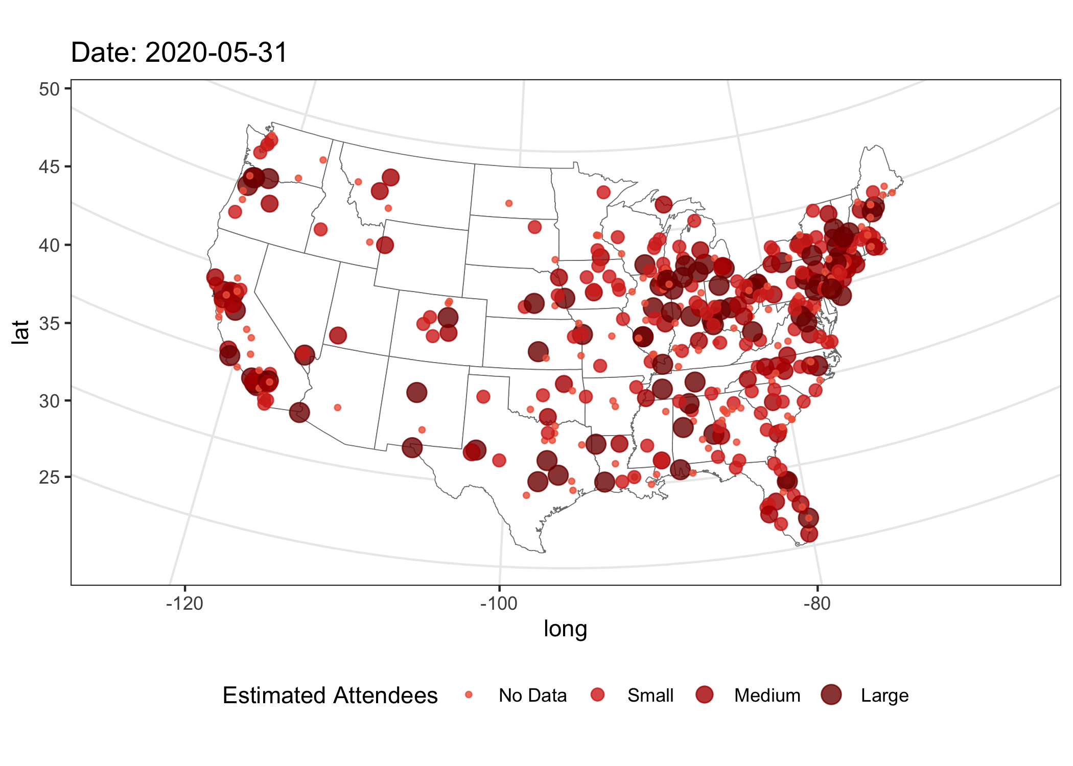
On Sudnay, May 31, 2020, we saw the largest number of protest, 448, all over the US:
map_p<-ggplot(data = us_states, mapping = aes(x = long, y = lat, group = group)) +
          geom_polygon(color="gray48",fill="white", size = 0.2) +
          coord_map(projection = "albers", lat0 = 39, lat1 = 45)  +
          geom_point(data=db_race %>% filter(Date==as.Date("2020-05-31")), aes_string(x="long", y="lat", group="Location",size="Estimated_Attendees",color="Estimated_Attendees"),alpha=0.8)  +
          scale_size_discrete(name="Estimated Attendees", range=c(1,4)) +
          scale_color_manual(name="Estimated Attendees", values=c("#ef6548","#d7301f","#b30000","#7f0000")) +
          guides( colour=guide_legend()) +
          labs(title = "Date: 2020-05-31 ") +
          theme_bw() +
          theme(legend.position="bottom")

map_p
Comments and suggestions are always welcomed. You can send them to srmntbr2 at illinois.edu or ignaciomsarmiento at gmail.com
Session Info
system("hostname")
date()
## [1] "Fri Jul 10 11:47:53 2020"
sessionInfo()
## R version 4.0.0 (2020-04-24)
## Platform: x86_64-apple-darwin17.0 (64-bit)
## Running under: macOS Catalina 10.15.5
##
## Matrix products: default
## BLAS:   /Library/Frameworks/R.framework/Versions/4.0/Resources/lib/libRblas.dylib
## LAPACK: /Library/Frameworks/R.framework/Versions/4.0/Resources/lib/libRlapack.dylib
##
## locale:
## [1] en_US.UTF-8/en_US.UTF-8/en_US.UTF-8/C/en_US.UTF-8/en_US.UTF-8
##
## attached base packages:
## [1] stats     graphics  grDevices utils     datasets  methods   base
##
## other attached packages:
## [1] tidyr_1.0.3     maps_3.3.0      gganimate_1.0.5 ggplot2_3.3.0
## [5] stringr_1.4.0   dplyr_0.8.5
##
## loaded via a namespace (and not attached):
##  [1] Rcpp_1.0.4.6      plyr_1.8.6        pillar_1.4.4      compiler_4.0.0
##  [5] prettyunits_1.1.1 tools_4.0.0       progress_1.2.2    digest_0.6.25
##  [9] evaluate_0.14     lifecycle_0.2.0   tibble_3.0.1      gtable_0.3.0
## [13] pkgconfig_2.0.3   rlang_0.4.6       mapproj_1.2.7     yaml_2.2.1
## [17] xfun_0.14         withr_2.2.0       knitr_1.28        vctrs_0.2.4
## [21] hms_0.5.3         grid_4.0.0        tidyselect_1.0.0  glue_1.4.0
## [25] R6_2.4.1          gifski_0.8.6      rmarkdown_2.2     purrr_0.3.4
## [29] tweenr_1.0.1      farver_2.0.3      magrittr_1.5      scales_1.1.1
## [33] ellipsis_0.3.0    htmltools_0.4.0   assertthat_0.2.1  colorspace_1.4-1
## [37] labeling_0.3      stringi_1.4.6     munsell_0.5.0     crayon_1.3.4
Ignacio
Sarmiento Barbieri
University of Los Andes
- srmntbr2 (at) illinois.edu
- ignaciomsarmiento (at) gmail.com
- ignaciomsarmiento
Blogs/Links
These are blogs/sites I frequently visit