Mapping Racial Segregation in Chicago
This spring break I was reading a couple of papers about segregation in the US (Cutler and Galeser 1997 and Cutler et al 1999). A paragraph on Cutler et al (1999) caught my attention: “Chicago was the most segregated city in 1890, the fourth most segregated city in 1940, the most segregated MSA in 1970, and the fourth most segregated MSA in 1990”. As I was reading this I kept thinking on mapping out Chicago with more recent census data.
To keep things somehow comparable with these papers, I measure segregation using census tracts as unit of analysis. Census tracts have been widely used in these literature as a proxy for neighborhoods. My data set contains census tract level population by race coming out from the 2000 and 2010 U.S. Decennial Census. More specifically, data comes from U.S. Census Comparability Data prepared by Social Explorer (accessed March 22 2017). It reallocates data from the 2000 U.S. decennial census to 2010 geographies which allows us to explore changes over time at the tract level. Which allows us to look at how segregation has changed within specific census tracts.
Measuring Segregation in Chicago
There are many ways to measure spatial segregation, here I follow Cutler et al (1999) and focus only on two indices: dissimilarity and isolation. They are defined as follows
Dissimilarity Index
If African Americans disproportionately reside in some areas of a city relative to whites, we say that dissimilarity between the two races is high. The index of dissimilarity is defined as
\[\text{Dissimilarity} = \frac{1}{2} \sum_{i=1}^{N} | \frac{AA_i}{AA_{total}}- \frac{AA^c_i}{AA^c_{total}}|\]where \(AA_i\) is the number of African Americans in tract i, and \(AA_{total}\) is the number o African American in the city as a whole, \(AA^c_{i}\) is the number of non African Americans in tract i, and \(AA^c_{total}\) is the number of non African Americans in the city.
This index is between 0 and 1. A dissimilarity index greater than .6 denotes high segregation, between .3 and .6 moderate segregation and smaller than .3 is considered low segregation.
Isolation Index
Even if African Americans cluster in some neighborhoods relative to non African Americans, this does not imply that African Americans have no contact with the rest of the population. To measure isolation the literature has come up with the following index:
\[\text{Isolation} = \frac{\sum_{i=1}^{N}\left(\frac{AA_{i}}{AA_{total}}.\frac{AA_{i}}{persons_{i}}\right)-\left(\frac{AA_{total}}{persons_{total}}\right)}{1-\left(\frac{AA_{total}}{persons_{total}}\right)}\]It measures the proportion of the city area inhabited by the average African American:
\[\sum_{i=1}^{N}\left(\frac{AA_{i}}{AA_{total}}.\frac{AA_{i}}{persons_{i}}\right)\]where the notation is as before and \(persons_i\) denotes the total population in tract i. To account by the size of the African American population in the city, the total proportion of African Americans is subtracted, and then we normalize by the proportion of non African Americans. As before an index of isolation greater than .6 denotes a high level of isolation.
Calculating these indices in R
As I mentioned before my data set contains African American population and total population by race for the years 2000 and 2010 by 2010 census tracts. A sneak peek of my data can be done with the head() function.
head(census)
##       geoid10   community    AA.00 AA.10 Total.Population.00 Total.Population.10
## 1 17031010100 ROGERS PARK 3022.984  2437            5371.067                4854
## 2 17031010201 ROGERS PARK 2858.000  2350            7564.000                6450
## 3 17031010202 ROGERS PARK 1033.000   953            3142.000                2818
## 4 17031010300 ROGERS PARK 2117.000  1722            6649.000                6236
## 5 17031010400 ROGERS PARK  823.000   729            5325.000                5042
## 6 17031010501 ROGERS PARK 1734.339  1300            4761.687                4091
The data set is called census and contains 5 variables: geoid10 denotes the census tract FIPS code. I call it geoid because it will make things easier when joining the data to our shapefiles. It contains a variable that indicates which of the 77 community area the tract belongs to. AA.00 and AA.10 is the African American population in tract i in the years 2000 and 2010 respectively. Total.Population.00 and Total.Population.10 are respectively the total population in tract i in 2000 and 2010. Note that the figures for 2000 are estimates prepared by Social Explorer.
Estimating the proportion of African Americans and non African Americans is a straight forward operation in R
#Proportion of AA
#2000
census$prop_AA_00<-census$AA.00/sum(census$AA.00)
#2010
census$prop_AA_10<-census$AA.10/sum(census$AA.10)

#Proportion of non AA
#2000
census$prop_AAc_00<-census$Total.Population.00-census$AA.00
census$prop_AAc_00<-census$prop_AAc_00/sum(census$prop_AAc_00)

#2010
census$prop_AAc_10<-census$Total.Population.10-census$AA.10
census$prop_AAc_10<-census$prop_AAc_10/sum(census$prop_AAc_10)
we have now calculate for each census tract the components for our indices
#Dissimilarity
census$dissimilarity.00<-census$prop_AA_00-census$prop_AAc_00
census$dissimilarity.10<-census$prop_AA_10-census$prop_AAc_10


#Isolation Index
census$prop_AA_t_00<-census$AA.00/census$Total.Population.00
census$prop_AA_t_10<-census$AA.10/census$Total.Population.10
we need also the proportion of African Americans in Chicago in both years
prop_AA_city_00<-sum(census$AA.00)/sum(census$Total.Population.00)
prop_AA_city_00
## [1] 0.3661763
prop_AA_city_10<-sum(census$AA.10)/sum(census$Total.Population.10)
prop_AA_city_10
## [1] 0.3281672
Note that the proportion of African Americans has gone down from 36% to 32% in the City from one year to the next, note also that Chicago is one of the cities in the country that has seen their population go down about 6.8%
(sum(census$Total.Population.10)-sum(census$Total.Population.00))/sum(census$Total.Population.00)
## [1] -0.06868247
Next, I create a data frame to put my results in and that will help me with the visualization of the results
indices<-data.frame(year=factor(c(2000,2010,2000,2010)), index=factor(c(rep("Dissimilarity",2),rep("Isolation",2))), value=rep(NA,4))

indices$value[indices$year=="2000" & indices$index=="Dissimilarity"]<-0.5*sum(abs(census$dissimilarity.00))
indices$value[indices$year=="2010" & indices$index=="Dissimilarity"]<-0.5*sum(abs(census$dissimilarity.10))

indices$value[indices$year=="2000" & indices$index=="Isolation"]<-(sum(census$prop_AA_00*census$prop_AA_t_00)-prop_AA_city_00)/(1-prop_AA_city_10)
indices$value[indices$year=="2010" & indices$index=="Isolation"]<-(sum(census$prop_AA_10*census$prop_AA_t_10,na.rm = T)-prop_AA_city_10)/(1-prop_AA_city_10)

indices
##   year         index     value
## 1 2000 Dissimilarity 0.8259534
## 2 2010 Dissimilarity 0.7934081
## 3 2000     Isolation 0.7029760
## 4 2010     Isolation 0.6942736
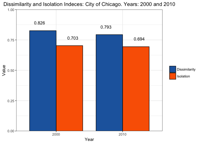
To visualize these results I use a ggplot bar plot. A key thing to remember here is to include position=position_dodge() to get the bars side by side.
require(ggplot2, quietly = T)
ggplot(data=indices, aes(x=year, y=value, fill=index)) +
  geom_bar(colour="black", width=.8, stat="identity", position=position_dodge()) +
  scale_fill_manual(name="",values= c("#2166AC","#FA6300")) +
  geom_text(aes(label=round(value,3)), vjust=-2,position = position_dodge(width = 1)) +
  xlab("Year") +
  scale_y_continuous(limits=c(0,1), expand = c(0, 0)) +
  ylab("Value") +
  ggtitle("Dissimilarity and Isolation Indices: City of Chicago. Years: 2000 and 2010") +
  theme_bw() +
  theme(plot.title = element_text(hjust = 0.5))

This plots help visualize that Dissimilarity and Isolation are at very high levels in Chicago for both years. Note that the dissimilarity index went down about 3% points. One thing to think here about is why this happened, are people really integrating more? We saw that population in Chicago went down, but if we look at African Americans we can see that this group experienced the biggest reduction in population.
# % change Af. Am. population
(sum(census$AA.10)-sum(census$AA.00))/sum(census$AA.00)
## [1] -0.1653534
# % change non Af. Am. population
(sum(census$Total.Population.10-census$AA.10)-sum(census$Total.Population.00-census$AA.00))/sum(census$Total.Population.00-census$AA.00)
## [1] -0.01283318
Thus dissimilarity seem to be improving just because African Americans are fleeing from Chicago. The Isolation index takes into account these changes since it normalizes by the total population of African Americans, and thus there’s almost no change in the index.
Mapping Dissimilarity
The next step is to map out which census tracts are the one more segregated. To do so I get the census tract Shapefiles provided in Chicago Data Portal. To load this files I use Dan’s McMillen McSpatial package available through CRAN
require(McSpatial)
tracts<-readShapePoly("Census_Tracts_2010/Census_Tracts_2010.shp")
Once I have the Shapefile, I merge my previous calculations to the polygons using dplyr’s left_join() function.
require(dplyr,quietly = T)
tracts@data<-left_join(tracts@data,census, by="geoid10")
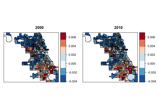
To get a nice and consistent coloring, I first define a set of breaks, and assign the colors that I want for each break. Colors that I chose are taken from the RdBu palette in RColorBrewer.
breaks<-seq(min(tracts@data$dissimilarity.00,na.rm=TRUE),max(tracts@data$dissimilarity.00,na.rm=TRUE), length.out = 8)

col<-c("#2166AC", "#67A9CF",  "#F7F7F7","#D1E5F0", "#FDDBC7", "#EF8A62", "#B2182B")
next I use the spplot function. This function is an extension of the plot function and it’s particularly useful when trying to fill polygons with colors. The side by side plotting with spplot is kind of tricky because it uses the Trellis graphics system. To get side by side plots, first we assign the plots to an object and then print them specifying their positions as argument.
map_00<-spplot(tracts,"dissimilarity.00",at=breaks, col.regions=col, main=list(label="2000",cex=1))
map_10<-spplot(tracts,"dissimilarity.10",at=breaks, col.regions=col, main=list(label="2010",cex=1))

print(map_00, split=c(1, 1, 2, 1), more=TRUE)
print(map_10, split=c(2, 1, 2, 1), more=FALSE)

With our maps plotted it’s clear that census tract with the greatest difference between the proportion of African Americans and non African Americans are located in the West and South sides of City. To get a more detailed account we can also rank the census tract based on the difference between the proportion of African Americans and non African Americans. This is done using the order function:
census[order(-census$dissimilarity.00 ), c("community", "dissimilarity.00", "dissimilarity.10")]
##                  community dissimilarity.00 dissimilarity.10
## 331                 AUSTIN     6.997303e-03     6.976010e-03
## 281          HUMBOLDT PARK     6.785733e-03     5.979873e-03
## 328                 AUSTIN     6.636126e-03     6.050072e-03
## 456            SOUTH SHORE     6.479237e-03     6.579871e-03
## 719            AVALON PARK     6.358272e-03     6.940443e-03
Austin, Humboldt Park in the West side, South Shore and Avalon Park in the South contain the top 5 most segregated census tracts in the City of Chicago.
Comments and suggestions are always welcomed. You can send them to srmntbr2 at illinois.edu.
References
Cutler, David M., and Edward L. Glaeser. “Are ghettos good or bad?.” The Quarterly Journal of Economics 112.3 (1997): 827-872.
Cutler, David M., Edward L. Glaeser, and Jacob L. Vigdor. “The rise and decline of the American ghetto.” Journal of political economy 107.3 (1999): 455-506.
Ignacio
Sarmiento Barbieri
University of Los Andes
- srmntbr2 (at) illinois.edu
- ignaciomsarmiento (at) gmail.com
- ignaciomsarmiento
Blogs/Links
These are blogs/sites I frequently visit